Cuil New Search Engine has Webmasters SEO Masters Pretty Hot
Posted by Marty Dickinson on Jul 31, 2008
Maybe it was the anticipation with all the pre-hype. Maybe it was the hope for something better. Mabye some just wished Google would feel some pain (not that they are without challenge anyway). The new Cuil.com search engine (pronounced “cool”) was launched on Monday and all week webmasters and SEO professionals have been in a mad frienzy trying to figure out if Cuil will be the “Google Killer” everyone in the online industry has been waiting for or if it’s just a quick throw-together search system to attract Microsoft to spending a few billion on a new company after a big hit.
Cuil was formed by some former Google employees who helped take Google’s search system to the next level. Classic case of employees getting together and leaving the company to go do their own thing and make a million bucks right? That’s where the questions arose. More on that later. First, check this out…
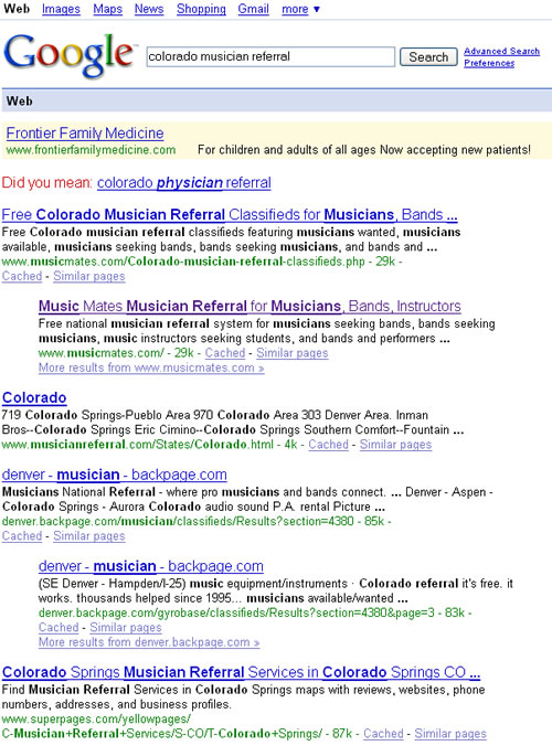
I’m going to throw my 2 cents into the ring about Cuil. First, let’s use an example to demonstrate what al the fuss is about. If I search Google for one of my websites MusicMates.com which is a national musician referral but based out of Colorado, here’s what I get:
Now let’s take a look at the new Cuil search engine’s results where I also searched for Colorado musician referral. Notice how there are 3 columns results instead of how Google displays only two. That’s actually my first question about Cuil is why they chose three columns? If we’ve been conditioned by all search engines to look in the top left corner for search results, wouldn’t it make sense to just have two column results? And, second, if you have three columns, and I click on one of the three columns, will the most accuarate results be going down the column or across the top? Or, did they figure my Music Mates site has the most focus so, the #1 search result is really in the middle of the page?
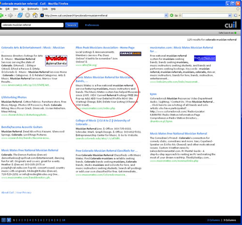
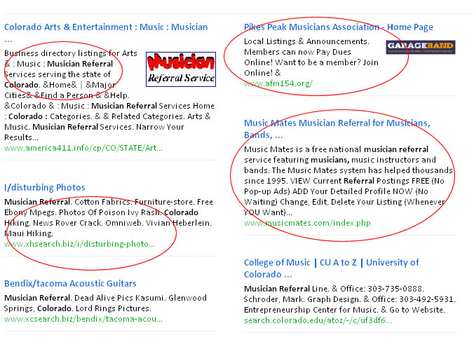
The next thing to consider is Cuil’s relevance of search results. Consider the image below where my Music Mates site listing is surrounded by other sites that have links to Music Mates. Now, how could a site that is so well optimized for a state be listed less in relevance than another site linking to it? I mean as a search engine, the whole idea is to showcase the main website that the links point to as the source or, in this case, the online tool.
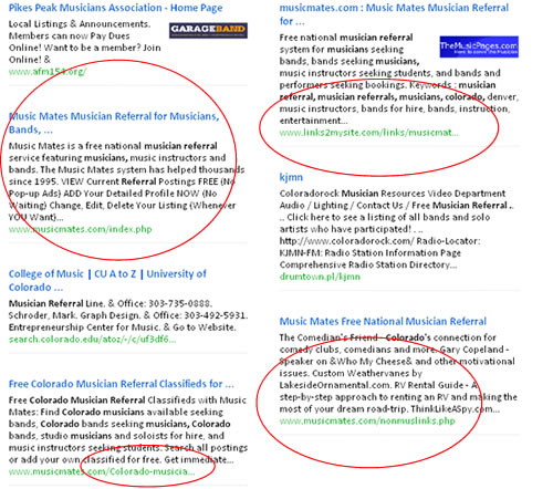
Then a blowup of the left side of the screen with my MusicMates description in the same spot, just looking at the two left columns below now. How did that “I/disturbing photos” get there? And, how could it be more relavent than my Music Mates posting?
Then, shown to the top is a single musician referral that could arguably be in competition with Music Mates. That’s not a good percentage for Cuil in my opinion.
Now, you might think, okay Marty, so the dudes in the top left beat you out. Stop whining and optimize Music Mates better! Well, when I clicked through that link, here’s what I got. I have no idea where Cuil picked up that “Musician Referral Services” image. It’s nowhere to be found in the site that you get to after the click through. I have no idea why Cuil does not consider Music Mates to be a higher authority since that’s ALL music mates does is “musician referral” whereas this directory gets top position as shown:
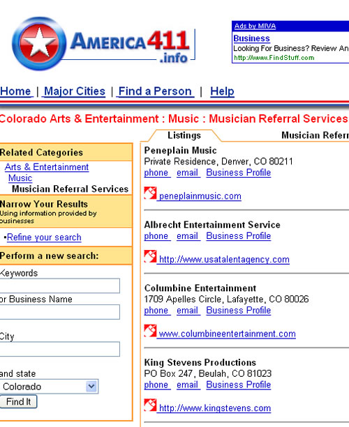
Even if you click through the next page Arts & Enterntainment Music link in the top left, you still don’t get anywhere close to finding a dedicated musician referral site, certainly not one better than Music Mates (me biased). And, I can think of a dozen or so organized referrals that SHOULD be listed here but are not. Why is that if they claim to have more istings already than Google does?
Some webmasters are suggesting it’s because Cuil is listing all the crap and duplicate page content that Google has spent all these years trying to get rid of. Personally, I think the Cuil crew knew exactly what would happen. If they launched the best search results they could out of the gate, there would be little room for improvement.
With quite a few imperfections in Cuil, there’s nowhere for them to go but up. Certainly, there could be room for someone to sweep in and buy their technology, but I don’t see that as being very attractive to Microsoft. The MS search is certainly better than Cuil already and Cuil does not “yet” feature a pay-per-click model. And, that’s really what Microsoft is after…the money!
Take a look at Cuil.com and search for your website and maybe a few competitors. Share your views here. Whatever the case, it will be interesting to see what happens to Cuil in 6 months. Eithe they’ll get their act together and really become competitive by offering quality search results, or it could all just go by the wayside. Who knows, at least they got some great press coverage out it although the backlash from users was pretty brutal.
Google Adwords Course Gets Two Thumbs Up
Posted by Marty Dickinson on Jul 28, 2008
Everything I learned for the first two years of using Google AdWords was from a single book. It was that good, I didn’t need another…until I discovered thie one I’m about to recommend to you here. Same author, same book, just updated. And, you don’t even have buy the book right off the bat. Just get used to the guy first by signing-up for his free ecourse.
Google AdWords to a business owner today is the equivalent of what a telephone used to mean to a salesperson 20 years ago. Both have been described as the most cost-effective, measurable promotion avenues of their time. If you don’t know how to manage a Google AdWords campaign for your business or product, it’s the equivalent of not being able to talk coherently to a prospect on the phone about your business. If you go another day, week, month before learning how to setup an ad campaign, split test ads, and monitor your conversion rates another year will slip by and you’ll look back on this moment why you didn’t take the next step!
Now, I’ll be honest. I’ve got this banner I’ve posted and when you click on it and eventually buy the book I’m recommending, I’m going to get a commission for the sale. If you don’t have any affiliate programs of your own, then that is a whole different discussion we need to have and the subject for another post.
But, that’s one of the best uses of Google AdWords is to promote affiliate products related to your industry and sphere of influence. You’re intereted in the blog topics I write about related to websites and Internet marketing, so this is a fitting affiliate product for me to recommend to you. See how that works?
Get started with Google AdWords today and there’s just no reason for you to try other, far more expensive programs by other speakers. Believe me I’ve seen what the other guys are offering and there’s really nothing better than this book, especially to get you started.
Free WordPress Blog Themes | Free WordPress Blog Templates
Posted by Marty Dickinson on Jul 21, 2008
 Here’s a free WordPress Themes and WordPress Templates site that I haven’t seen before. The themes and templates for WordPress blogs are quite more artistic than usual. Certainly bettet than the traditional themes found at WordPress.org. From what I can see, they’re all free as well.
With that said, let’s think for a moment about what makes a WordPress blog theme something that will add to your bottom line. I mean, you wouldn’t want to change your current WordPress blog theme to something new just for the sake of being something new, would you? Of course not. Think of all of those frequent readers that would just get thrown off. Consistency is vital on the web.
When you look at the top 100 blogs at Technorati.com it’s pretty easy to see some similarities among themes.
Great Atkins Diet Post
Posted by Marty Dickinson on Jul 19, 2008
I was truly amazed at this Atkins post. It was great!
Best Google Adwords Headlines
Posted by Marty Dickinson on Jul 14, 2008
I was splitting up search phrase results and adding a whole slew of Google Adword campaigns to promote my latest site LaughAtLayoffs.com. On Friday, July 11th at about 2pm, I got this crazy idea to create a free mini-manual for people who are working for companies in financial strife and fearing the economic henchmen.
I just started writing. By 6pm, I had 14 pages of what became Laugh at Layoffs. When it came time for me to run some Google Adwords to the page, I needed a bit more inspiration. So, I searched around and arrived on a site that gave me the neatest little rundown of Adwords tips that I’ve seen lately. And, I was able to craft over a dozen headlines and completely different Google Adwords headlines and ads within about 5 minutes of reading the article.
Now, this post has been out there for a while, but the content is still relevant for sure. I’m a little skeptical about one thing that was mentioned where the author said something about using any verbiage you can and that it doesn’t matter what you say in your ad to get attention, but if you read these tips for the broader picture, it’s right on!
All Day Internet Workshop at CIPA in Denver
Posted by Marty Dickinson on Jul 8, 2008
 Just a quick note that I’ve been invited once again to present at Colorado Independent Publishers Association (CIPA). This time, it’s for a full-day workshop on Saturday, July 19, 2008.
The focus will be on blogs (of course), traffic, improving sales conversion rates, and just a whole heck of a lot of new things happening in the web world. But, there will be an emphasis on promoting books.
So, if you’re not writing a book or have a book that you’ve published, just be aware there will lots of “book talk.” But, the networking at any CIPA event is simply incredible. You will truly be amazed at the contacts you make at a CIPA event.
This is not a seminar where I tell you a little and then sell you the goods. There are plenty of people in that business. My workshops are training classes so come prepared to learn and do a bit of sharing what you know at the same time.
I heard yesterday there are already more than 30 registered so if you’d like to attend, might want to get in sooner than later. I’m not sure what the cutoff is but I’m sure it won’t be much more than 50…just the way I like it. Hope to see you there!
2008 Olympics Website Reviewed
Posted by Marty Dickinson on Jul 7, 2008
The 2008 Olympics website will be one of the most visible websites in the world for the next two months. You would expect their website to also be an Olympic example of what a website should look like, feel like, sound like and smell like. This purpose of this post is to examine the qualities of the 2008 Olympics website in hopes that the rest of us can model after what their developers have done well and run as fast as we can in the other direction from repeating the mistakes they’ve made.
On a scale of 1-10, 10 being best, I’ll give it a vote of 5. Why such a harsh grade? Well, let me cover some good things first. There are several things I think they’ve done a good job with for the site:
1. The immediate question is answered as to exactly “when” the Olympics will be held. I’ve had 4 people ask me that over the past week, so the date is not something people know.
2. I like their use of the Upper Right Quadrant (URQ) where they provide links to alternate languages of the site, their tagline stands out “One World One Dream” and gives me a little entertaining countdown which is at today “31 days to go.” In the URQ also answers another question for me as I’ve always wondered what the temperature in Beijing China is. And then there’s a search box for me to type just in case the navigation doesn’t give me what I’m looking for.
3. I sort of bypassed the Flash rotation (which I’ll come back to in a moment) and went to the left navigation which is simple and categorized, pretty easy to follow.
4. The overall look of the site is welcoming and entertaining. I like the use of green and blue which sends a warm, let’s-unite-the-world kind of message.
Here are several areas where I believe the site could “still” be improved:
1. I’ve looked at this site on various screen resolutions and I just feel that the Ticketing Info section on the mid-right column should be more pronounced and part of the URQ. Buy Tickets Now would be much more appropriate.
2. Maybe I haven’t had enough coffee yet, but the scrolling images in the middle of the page under the Olympic Q&A completely missed me. Only after I spent 15 minutes on the site looking at other things did I discover you could mouseover them to discover they were links to event descriptions.
3. If people are not coming to the site to find the general date, or to buy tickets, they’re wanting to know what the schedule of events is. This is another item that should be right in the forefront of the site. This can be found under “Sports & Venues” on the left nav…but it doesn’t say “Events Schedule” until you get into that section.
4. Okay, so, the Flash part. Um, guys, you have video lower right on the site. Why not just use the video clips so that people see them right away when they land on the home page?
5. The Olympic Q&A section is worthless. They should remove it entirely or build it into a real Q&A that has potentially hundreds of questions answered. If I was even thinking about attending the olympics, I would have tons of questions.
6. The banner photo of the China girl scared me! It looks like something out of an old wax museum movie. There are far more beautiful photos of China girls you could find for that banner. Don’t scare me like that!
7. Finally, there’s not enough emphasis on getting me to “register.” You’ll see the register/login next to the search text box. But, there’s no reason mentioned for me to register. To even get me to click on that register link, they need to tell me why I should. Othewise, I’m kinda lost.
So, there’s my justification for giving a 5 for a review of the 2008 Olympics website to be held in Beijing China on August 8-24, 2008. Many important pieces have been added to give the site its entertainment value and ease of navigation and welcoming warmth. But, several things as mentioned could be added to get more results. We’re still in July at the time of this post. Hopefully they will make some changes by the time I start looking for event schedules.
How would YOU review the Olympics website? Give it your rating 1-10. Just fill in a comment below and make sure to put a link to your website or blog.
Cartoons on Your Website to Make You Money
Posted by Marty Dickinson on Jul 4, 2008
Seeking Alpha blog reported that Google is coming up with an “experiment” expected to launch in September 2008 where they will produce a series of 50 cartoons that are each 2 minutes or less in length. You’ll be able to add these cartoons to your website and they’ll be much like Google Adsense where you the website owner will get a little cut each time one of your visitors clicks on the link to watch the video.
This is seen as Google’s way of monetizing video for themselves. I see it as a potential new method for viral marketing. If you see a good video on YouTube for example, you might send it to a friend right? If you come across a website with a hilarious cartoon, I think I might forward the page of the website to someone too.
The problem with that is the poor advertiser. I mean, someone has to pay for all of those clicks, right? If I search for a topic and come across a page on a website that has one of the cartoons, great, I’m targeted traffic. But if I send the page on to a friend or three or four friends, and tell them to go watch this cool new cartoon I’ve found, well, the advertiser suffers.
Suddenly their targeted marketing effort gets the additional traffic, but it probably won’t be targeted traffic. So, I dunno, I’m kinda skeptical about putting cartoons on my website. But, you know me, I’ll have to give it a try to see if my hunch is right.
So, go for it Google! Give me cartoons and I’ll make a buck or two off some AdSense style cartoon ads. Just hope the advertisers don’t blacklist me for sending a bunch of people to click on the cartoon ad only to see the cartoon. Or, maybe that’s their hope.


