How a Custom Theme Increased Twitter Follows
Posted by Marty Dickinson on Feb 4, 2009
Want to increase your Twitter follows? Add a custom theme using these simple steps. Yesterday, we all wanted to get our pages to the top of Google. Today, we just want more “follows” on Twitter. It’s partially a status symbol and part good business sense. The more people who are following you, the more people you have the opportunity to build relationships with.
This past Saturday, I finally had a few hours to create a background for my Twitter profile. This is Tuesday night and I have received 62 new follows since then. The interesting thing is that I did absolutely nothing between then and now other than one thing; I added a custom background.
Twitter allows you to upload a custom background. First login and go to the “Design” link in the top right corner of your profile page. Click “Background Image” to upload from your computer to your Twitter account.
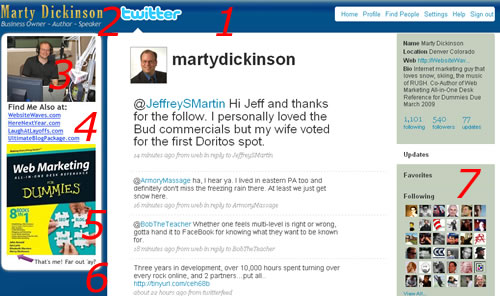
But, let’s talk about what you want in your Twitter background. I’ve outline 7 components of what I added. Not that any of these are absolutely essential, but most of them are:

1) Shell – The main body of Twitter is white, so I made the inside of my body image to be white too.
2) Logo – You’re just a person on Twitter, but your name is still a logo and it’s certainly okay to come up with a slogan for yourself.
3) Photo - Since my main Twitter photo is sort of formal, I added one that is pretty casual and reflects a playful side, but also showcases a part of my business, in this case appearing on a radio talk show.
4) Links - Here’s your money opp! Add some links where you want people to check you out more. Of course Twitter allows you to add a website link in your profile admin area, but this is much more prounounced.
5) Special - List either a special you’re having or special news about YOU. In this case, I have a For Dummies book coming out in a few months. So, it’s natural to want to promote it. But, people respond to book covers online so, if you have a book out, feature it in your Twitter profile.
6) Something playful - I mentioned the book, but the playful line below it is what gets peoples’ attention. Why? because it’s not so corporate and it’s kind of playful too. I love the emails I get like, “ha, loved the caption at the bottom of your book cover.”
7) Right column color - This is a tricky one. The colors are changed in the “change design colors” link within Twitter, but it’s up to you to figure out which color will go well with your profile and your custom background. Choose a color that isn’t so bright that people are blinded that the leave. keep a soft, but dark color to make your text stand out.
Once you’ve saved your background image and upload it, make a Twitter post that you’ve changed your background and you’d like others to critique it.
I’m actually kind of amazed that Twitter actually even offers this level of customization. I mean, you can put anything into an image and upload it. But, in the past week, after seeing months of pretty meaningless amounts of additional follows, I get this spike. And the only thing I’ve done different since Saturday is add a custom background.
Have you seen any difference in follows or traffic since adding a background? Report your findings here.
Click a Star to Rate This Post:
Tell Others About This Post:
 Email This Post to a Friend


